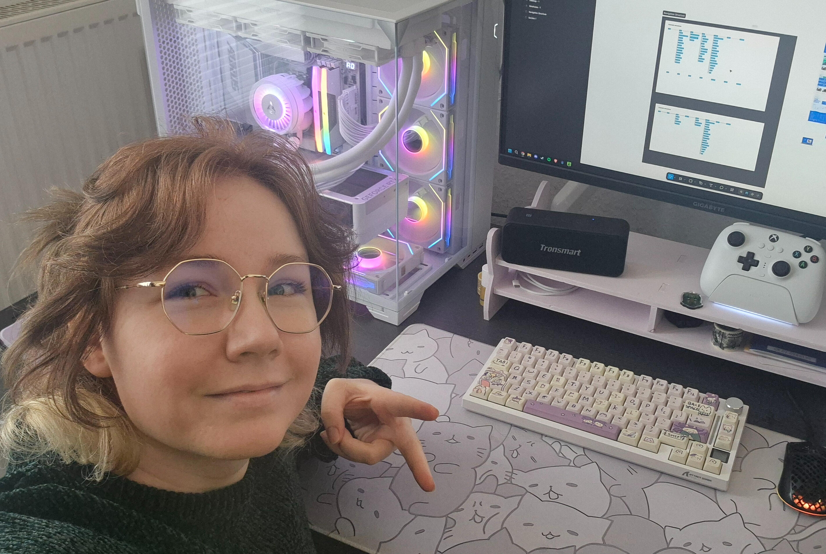
Quinn Dier
UX designer,
web developer,
visual artist.
Building human-centered products with technical depth.
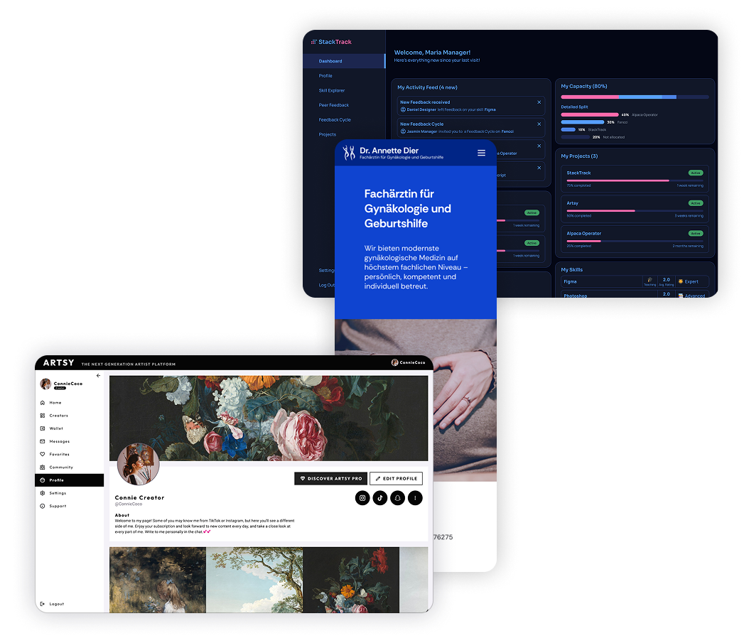
Some of my favorite
Projects

StackTrack
Fixing the lack of growth and skill visibility in a company
Designing an internal skill-tracking ecosystem alongside engineering to increase talent visibility and streamline project staffing. Currently in active development, this project leverages an AI-generated baseline to build an inclusive, organized platform that simplifies talent acquisition and reduces resource allocation times
Client: Public Cloud Group
Role: Lead Designer
Duration: 3 months (2026)
Status: In Development

JWT Portal
Enabling JWT's customers to create and manage their support tickets
Transforming Jakob Wassertechnik’s customer support from a manual, phone-and-email operation into a scalable, self-service digital ticketing portal that eliminates administrative overhead.
Client: Jakob Wassertechnik
Role: UX Designer
Duration: 5 weeks (2024)
Status: Shipped

FANCCI
Salvaging the remains of an abandoned sensual creator platform project
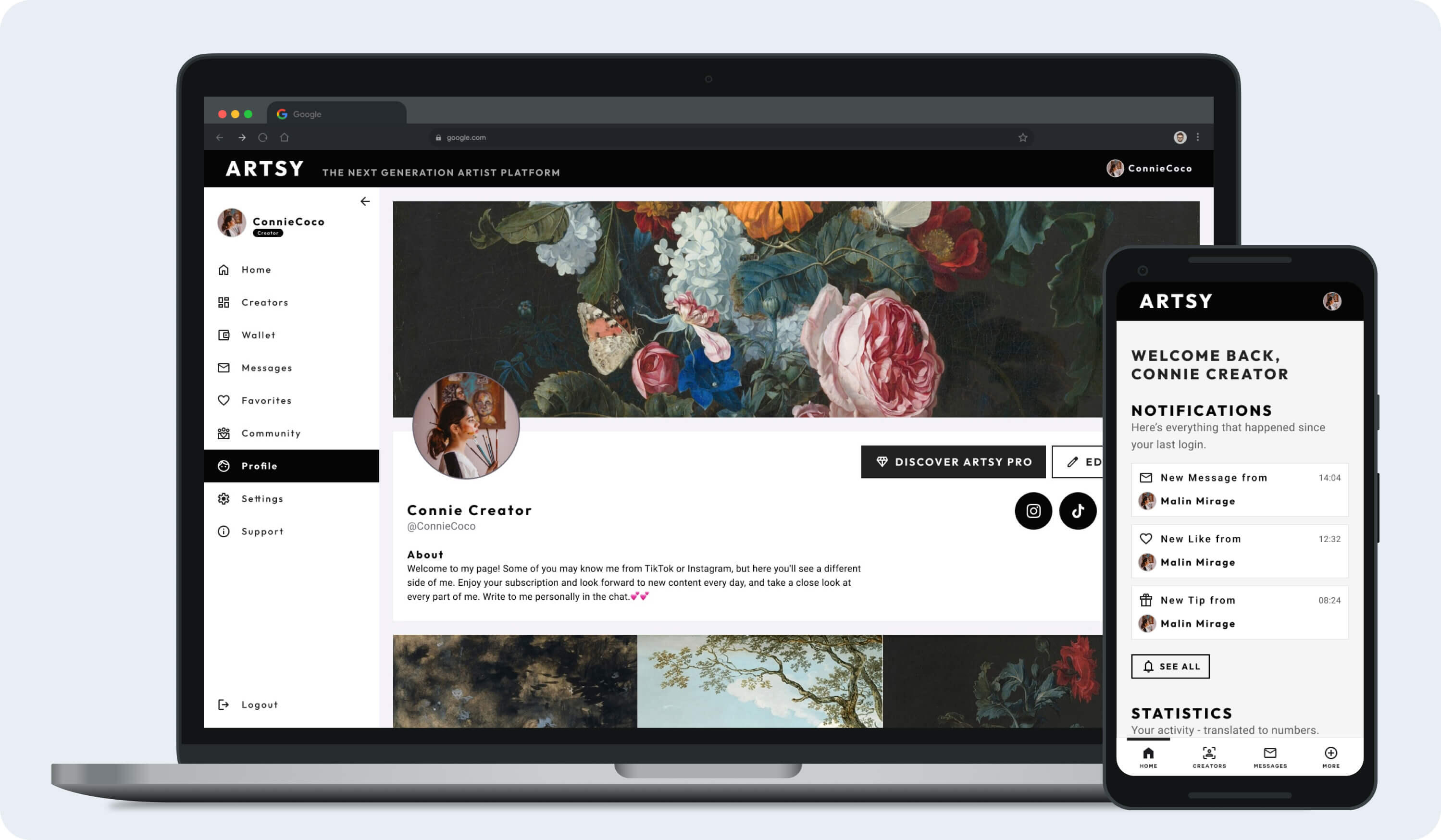
A concept born from an ambitious creator-market platform that pivoted into a personal product exercise following a client bankruptcy. This project demonstrates how I streamlined an over-scoped feature set into a minimalist, media-first side project, focusing entirely on enabling artistic expression and designing subtle, premium monetization flows for a refined target audience.
Client: Bitcci Ag., then just for fun
Role: Lead Designer
Duration: 6 months + 3 weeks (2025)
Status: Retracted, Case Study

Gynecologist
Optimizing the digital patient journey
A speculative redesign and retrospective of my first commercial web project from 2021—a live website for a local gynecological practice. This exercise evaluates my growth as a designer by auditing the UX and structural choices of my early engineering work, contrasting them with the modern accessibility, design systems, and user-centered strategy I would implement today.
Client: None
Role: Designer, Developer
Duration: 2 weeks
Status: Case Study
Honorable
Mentions
AMC Cook&Go Consulted on and participated in the app redesign. See in App Store: Apple - Google Play
AMC Cook&Go Evaluated the app for accessibility up to level AA of the WCAG 2.2, recommended next steps and implementation suggestions
Alpaca Operator Modernized design and UX of the 10 year old SAP Server management tool
Freenet.tv Evaluated the smart TV portal for accessibility to level AA WCAG 2.1, recommended next steps and implementation suggestions
DAW Caparol App Evaluated UX of the old app and contributed to re-design by re-structuring and optimizing the information architecture and interaction patterns, massively reducing navigation redundancy. See in App Store: Apple - Google Play
LeaseHub Evaluated the platform to identify quick, low implementation cost UX improvements and supplied alternative design recommendations
Webservatory Designed UI and UX for version alpha and helped implement the frontend
Concept artworks and
Illustrations
Interested?
Let's talk.
Impact
Created a skill tracking tool aiming to increase employee talent visibility and simplify project coordination for management. Initial acceptance when showcasing the demo was high, with several managers expressing urgency to gain access.
Client: Public Cloud Group
Role: Lead Designer
Duration: 3 months (2026)
Status: In Development
Issue
Skills and project knowledge lived across disconnected systems, resulting in a lack of growth and skill visibility, unclear hiring needs and underutilization of available talent.
PCG needed a centralized tool that increased organizational efficiency and employee development centered around collaboration and growth.
Goal
Creating a platform that supports organizational efficiency and employee development by building an accessible, fun community centered around collaboration and growth. StackTrack should cut down on project staffing time, increase overview on how projects are going and make users' skills and efforts clearly visible, thereby increasing motivation to develop new skills.
Getting the Ball rolling.
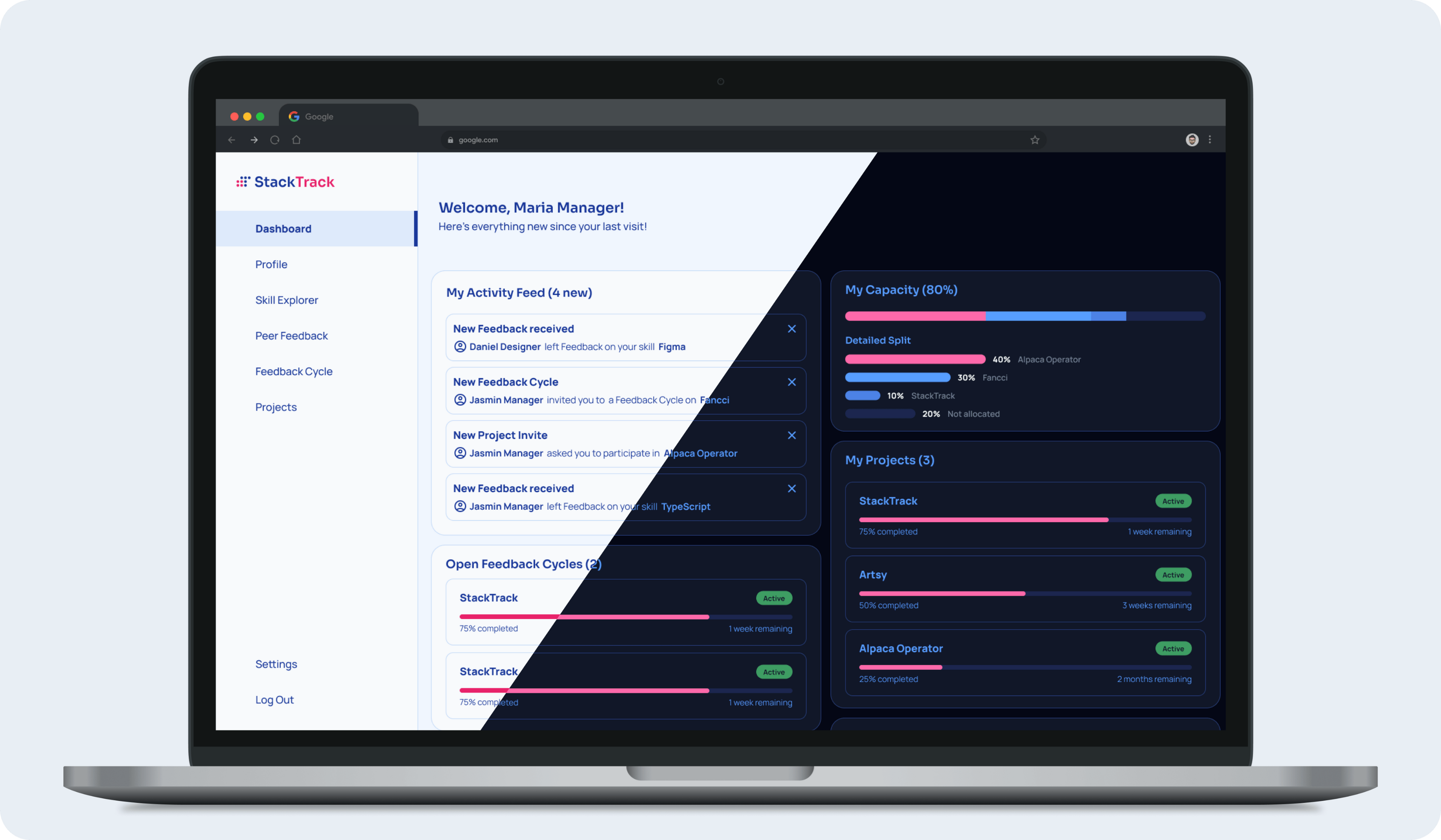
We initiated the ideation phase by leveraging Claude AI to rapidly explore and validate concepts based on the Product Owner’s discovery insights and the defined Alpha feature set. From there, we translated these concepts into tangible product architecture, mapping out the information architecture, user interaction flows, and structural layouts. Our primary focus was synthesizing data-heavy displays into clean, intuitive, and highly digestible user experiences.
Building the System.
We aimed for a clean, lightweight visual identity, using rounded corners and a minimalist layout accented by just a strategic pop of color. To add some depth and visual interest to the otherwise highly focused interface, we initially experimented with subtle gradients for skill designations to elevate the clean aesthetic.
Testing and Iteration.
"Once the interactive prototype was ready, we ran usability tests with five participants, using structured task sheets and follow-up questionnaires. Our main goal was to evaluate the clarity of the interface and ensure the overall experience was accessible to everyone.Identified issues
Color and Accessibility: The skill-level color coding failed to work as intended. Three participants noted visual disharmony, and four struggled with legibility, indicating a clear accessibility issue.
Feedback Loop Confusion: Our feedback cycle flow was unclear. All five participants experienced friction, leaving them confused about the process status of their tasks.
Dashboard Misalignment: The dashboard missed the mark on user expectations, as four out of five participants couldn't find the information they actually came looking for.
Copywriting Choices: Language choices mattered. Two participants explicitly mentioned that using the term 'Master' felt outdated and uncomfortable.
Polish.
These final screens served as the blueprint for our development team. To ensure a highly inclusive product, the interface adheres to WCAG 2.2 Level AA accessibility standards. Along with the design assets, I delivered detailed documentation to the developers, highlighting specific implementation notes to safeguard accessibility during production.
Takeaway.
This project reinforced several key principles that will shape my approach to future product design challenges:
Testing Assumptions Early Saves Engineering Time: Uncovering critical flaws in the dashboard layout and feedback loop with just five users proved how vital early testing is. Validating the prototype before handoff allowed us to pivot quickly, preventing costly design debt and development rework.
Accessibility is a Foundation, Not an Afterthought: The failure of our initial skill-level color coding was a great reminder that aesthetics must always serve usability. True WCAG 2.2 compliance means baking accessibility checks directly into our initial style guides, rather than auditing them at the end.
Design Handoff Requires Clear Documentation: Designing an accessible interface is only half the battle. Delivering detailed implementation notes to our developers bridged the gap between visual intent and functional code, ensuring the user experience wasn't lost in production.
UX Copywriting Dictates Product Tone: The feedback regarding the word 'Master' highlighted that microcopy carries immense weight. Content design must be evaluated just as closely as layout structure to ensure the product feels inclusive and welcoming to all users.
Interested?
Let's talk.
Impact
By transforming the manual support pipeline into an automated, self-service ticketing system, this design eliminates administrative bottlenecks significantly reducing operational overhead while giving B2B customers instant, real-time transparency into their maintenance lifecycle.
Client: Jakob Wassertechnik
Role: Sole UX Designer
Duration: 5 weeks (2024)
Status: Shipped
Issue
Relying on phone calls and emails to contact JWT representatives was no longer a sustainable way for customers to request maintenance, replacements, or repairs. While Jakob Wassertechnik already used an internal portal to manage backend support, we needed to bridge the gap and put a self-service ticket creation tool directly into the hands of the customers.
Goal
Our primary objective was to transition Jakob Wassertechnik's customer support from a manual, communication-heavy process into a scalable digital ecosystem.We aimed to design a frictionless, self-service ticketing portal that empowers users to log maintenance requests directly, while seamlessly feeding into the existing internal system to minimize administrative overhead.
Getting the Ball rolling.
To deeply understand the operational inefficiencies of the legacy workflow, we kicked off our discovery phase with an in-depth stakeholder alignment session with JWT's CEO.To guide this effort, she provided us with extensive internal documentation that cataloged the support team's most frequent operational friction points, administrative bottlenecks, and manual triage habits.Analyzing this documentation allowed us to map the business-critical requirements for the new customer-facing portal directly against the technical limitations of the existing backend.By synthesizing these executive goals with the day-to-day realities of the staff, we established a clear, validated foundation of user requirements and operational benchmarks before moving into the next phase.
Product Strategy.
Before diving into high-fidelity visuals, we spent significant time mapping the product strategy.
Our goal was to ensure that every interaction pattern we built directly served a business objective and respected our technical boundaries.
Strategic Trade-offs (Feature Prioritization): We intentionally limited the initial Alpha scope. While the executive roadmap included a multi-tiered customer chat function, our discovery data showed that 80% of support friction stemmed from repetitive maintenance logging. We prioritized a rock-solid, automated ticket form for launch, deferring the chat feature to conserve engineering resources and expedite time-to-market.
Operational Efficiency (Data Mapping): To eliminate manual triage by JWT staff, the interface logic was built around strict technical constraints. We designed the form to require specific, structured data inputs, such as pre-filtered device selection and standardized error categories. By forcing clarity at the point of customer entry, we ensured that incoming tickets could automatically route to the correct internal department without human intervention.
Defining Product Success (KPI Alignment): We established clear benchmarks to measure the design’s ROI post-launch. Success for this product isn’t measured by screen engagement time, but by efficiency metrics: reducing customer ticket creation time to under three minutes, and decreasing the total volume of manual support phone calls by at least 40% in the first quarter.
Polish.
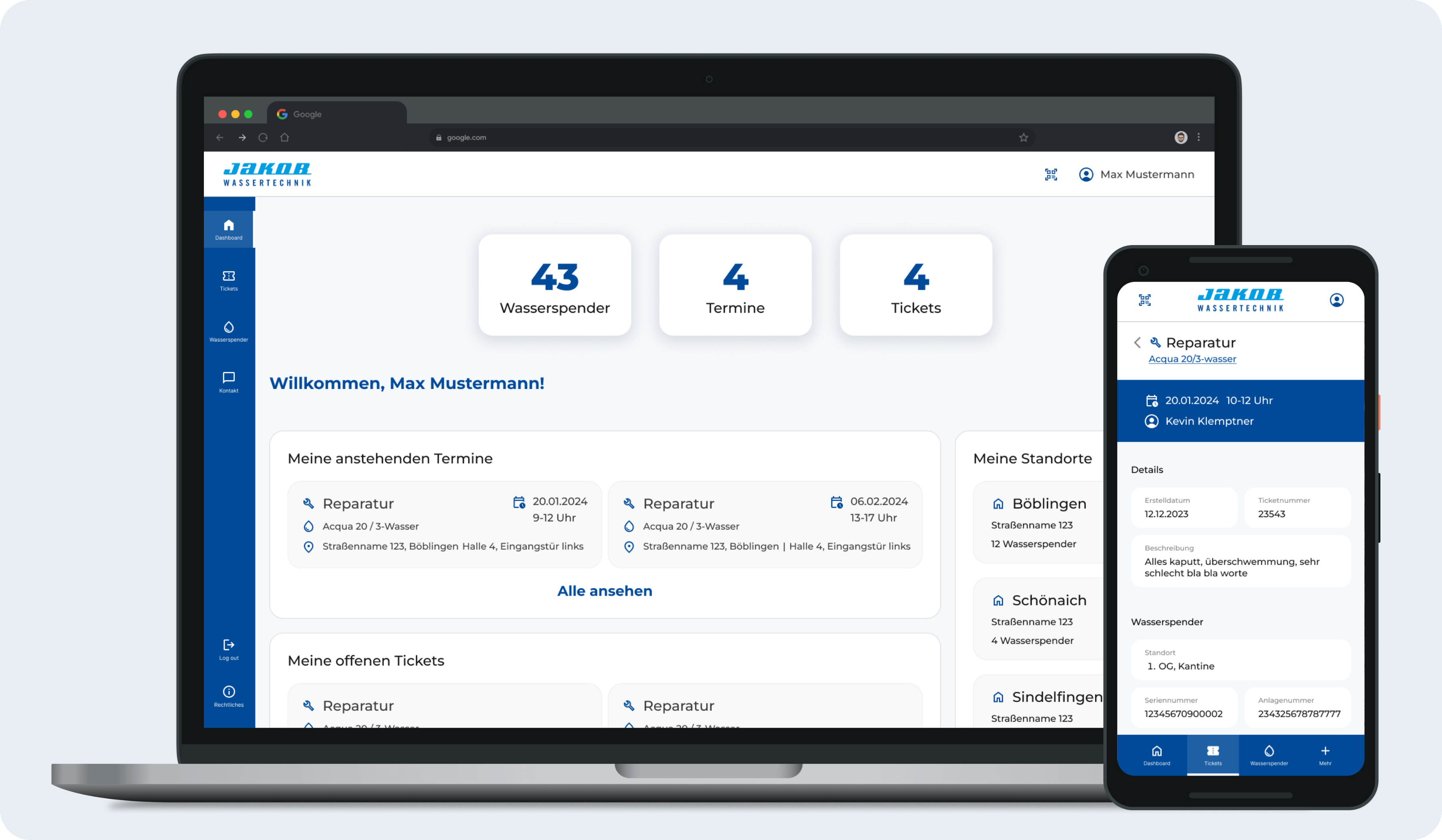
These screens were the final result the developers are working off of. Visually, they are WCAG 2.2 Level AA compliant (accessibility) and the devs have been handed a detailed documentation on things to keep in mind for an accessible implementation.
Takeaway.
This project reinforced the value of balancing strategic business goals with systematic design execution.
Aligning early with executive stakeholders and grounding our feature set in the CEO's operational insights allowed us to target critical business bottlenecks immediately, preventing scope creep before wireframing even began.Furthermore, designing within an established visual identity highlighted the importance of constraint management, requiring us to introduce complex, self-service ticketing architecture while strictly maintaining brand cohesion and user trust.Ultimately, successfully transitioning users from manual communication to a digital ecosystem came down to comprehensive service design; by ensuring the customer-facing interface seamlessly populated JWT's existing internal backend fields, we managed to eliminate administrative triage while offering users the real-time transparency necessary to replace legacy workflows.
Interested?
Let's talk.
Impact
Created a ticket portal that meets specifically non-digital-native users where they are and delivers them safely and promptly to their intended destination. Optimized the ticketing process for Jakob Wassertechnik customers according to user feedback.
Client: Jakob Wassertechnik
Role: UX Designer
Duration: 5 weeks (2024)
Status: Shipped
Issue
Skills and project knowledge lived across disconnected systems, resulting in a lack of growth and skill visibility, unclear hiring needs and underutilization of available talent.
PCG needed a centralized tool that increased organizational efficiency and employee development centered around collaboration and growth.
Goal
Creating a platform that supports organizational efficiency and employee development by building an accessible, fun community centered around collaboration and growth. StackTrack should cut down on project staffing time, increase overview on how projects are going and make users' skills and efforts clearly visible, thereby increasing motivation to develop new skills.
Getting the Ball rolling.
We started ideation by using Claude AI to rapidly generate ideas based around the findings of our product owner and the agreed-upon feature set for version Alpha.
Based on these, we went to the drawing board to flesh out the functional side: Information architecture, interaction flows, general layout, all with the aim of creating an experience that would be as intuitive as possible with easy to digest data displays.
Testing and Iteration.
With the interactive prototye created, we conducted usability tests with 5 participants using a task sheet and follow-up questionnaire. Our focus was on clarity of use and accessibility.Identified issues
Skill level colors did not work as intended and even reduced accessibility, creating visual disharmony as perceived by 3 participants and reducing legibility as reported by 4 participants.
Initial design for giving feedback in a cycle was unclear and led to friction during the process and confusion on the status of the task, as described by all 5 participants.
The dashboard did not accurately reflect the kind of information that 4 of 5 participants were hoping to find there.
"Master" as a word choice left an uncomfortable aftertaste with 2 participants.
Polish.
These screens were the final result the developers are working off of. Visually, they are WCAG 2.2 Level AA compliant (accessibility) and the devs have been handed a detailed documentation on things to keep in mind for an accessible implementation.
Takeaway.
This was a great opportunity to try out some unconventional UX ideas. Finding the balance between an interface that sparks joy while still maintaining professionalism was an interesting experience.
Interested?
Let's talk.
Impact
Created a ticket portal that meets specifically non-digital-native users where they are and delivers them safely and promptly to their intended destination. Optimized the ticketing process for Jakob Wassertechnik customers according to user feedback.
Client: Jakob Wassertechnik
Role: UX Designer
Duration: 5 weeks (2024)
Status: Shipped
Issue
Skills and project knowledge lived across disconnected systems, resulting in a lack of growth and skill visibility, unclear hiring needs and underutilization of available talent.
PCG needed a centralized tool that increased organizational efficiency and employee development centered around collaboration and growth.
Goal
Creating a platform that supports organizational efficiency and employee development by building an accessible, fun community centered around collaboration and growth. StackTrack should cut down on project staffing time, increase overview on how projects are going and make users' skills and efforts clearly visible, thereby increasing motivation to develop new skills.
Getting the Ball rolling.
We started ideation by using Claude AI to rapidly generate ideas based around the findings of our product owner and the agreed-upon feature set for version Alpha.
Based on these, we went to the drawing board to flesh out the functional side: Information architecture, interaction flows, general layout, all with the aim of creating an experience that would be as intuitive as possible with easy to digest data displays.
Testing and Iteration.
With the interactive prototye created, we conducted usability tests with 5 participants using a task sheet and follow-up questionnaire. Our focus was on clarity of use and accessibility.Identified issues
Skill level colors did not work as intended and even reduced accessibility, creating visual disharmony as perceived by 3 participants and reducing legibility as reported by 4 participants.
Initial design for giving feedback in a cycle was unclear and led to friction during the process and confusion on the status of the task, as described by all 5 participants.
The dashboard did not accurately reflect the kind of information that 4 of 5 participants were hoping to find there.
"Master" as a word choice left an uncomfortable aftertaste with 2 participants.
Polish.
These screens were the final result the developers are working off of. Visually, they are WCAG 2.2 Level AA compliant (accessibility) and the devs have been handed a detailed documentation on things to keep in mind for an accessible implementation.
Takeaway.
This was a great opportunity to try out some unconventional UX ideas. Finding the balance between an interface that sparks joy while still maintaining professionalism was an interesting experience.
Interested?
Let's talk.
Impressum
Quinn Alex Dier
Dorotheenstr. 31
40235 DüsseldorfTel: +491709065893
E-Mail: [email protected]